Tuesday, May 10, 2011

Alabama - Lester Beall


When I found this picture of the remains of this house, nothing but a doorstep and a few beams, it broke my heart. I immediately knew I wanted to focus on the aspect of making homes for people in Alabama again. I tried to emulate Lester Beall's designs by including diagonal stripes, simple text, a black and white photograph of the issue, and red, white, and blue to connect helping people in Alabama to patriotism. I also put a white triangular shape around my text to symbolize the tornado itself, with the aftermath below. I wanted the poster to be simple and striking, so I opted out of a lot of extra effects and symbols. I wanted the image to speak for itself.

The original image.


http://www.facebook.com/home.php?sk=group_124675937593174

Women in Advertising


Bayer's "Great Ideas" advertisement is a perfect example of the transition between the beginning of the objectification of women in advertisement in the Art Nouveau period and modern advertisement. His advertisement depicts women as a big part of decadent living, both as an object and as a source, and puts a negative spin on this "collage depicting affluence and decadence" (Meggs 347) by including a quote from Theodore Roosevelt, "The things that will destroy America are prosperity at any price, peace at any price, safety first instead of duty first, and love of soft living and the get-rich-quick theory of life." This implies that women are a byproduct of these things that Roosevelt says will destroy the country.
Women are pictured alongside money, diamonds, gambling, alcohol, and fruit that represents decadence and sexuality. Words like "Daily Double" and "Corruption" also encircle the main blonde woman. 

Today, it seems like this objectification and over-sexualization of women has been carried out to an extreme in advertising. Though instead of it being criticism as it is in Bayer's ad, it is a tool to push products by placing them on and around attractive women. Unfortunately, as it is often said, sex sells, so this pattern keeps going. I think it's absolutely ridiculous, particularly when the sexed up scenes in the ad have basically nothing to do with the product. Companies like Dolce & Gabbana, Calvin Klein, and American Apparel seem to just focus their ads more on the sex and women than on anything that they're selling, and sadly it works. Women are still associated with decadence and excess, it's now just seen as a positive thing that sells product. In my mind, it's not much better than pornography, and a lot of it is just, for lack of a better word, stupid.

Um, this is hot? It's more awkward to me. Like, kind of Leah Marie awkward.

Is she being raped? How is this good?

Again, just awkward.

The focus is definitely not on the jeans.


Because some of the pictures I found are extremely inappropriate and just awkward, I am posting a link to another blog post with a good collection of them.

http://damalagaitianwoman.blogspot.com/2010/07/im-just-saying.html

Nixon Esquire image


The Nixon cover of the Esquire magazine suggests that Nixon is effeminate and hiding behind a mask of make-up after losing the previous election "partly because [his] 'five o'clock shadow made him look evil.'" (Meggs 398) It inspires doubt subliminally by inferring that he is not who he claims to be and that he needs a team of people to help him cover up his real self. It is very straightforward and does not need words to convey its meaning. It also focuses in a subtle way on the people surrounding Nixon, his campaigners and team who were enabling his mask.


This parody of the Obama "Hope" posters is both similar and different in its approach to criticizing the former presidential candidate. This image does use a word, but only one, and it is more of a visual interpretation because it copies the way the original poster says "Hope" or "Change" at the bottom. The word "Obey" is used as a graphic element in that it holds the Obama campaign logo as well, associating his campaign with a dictatorial type of leadership. The way the word changes the picture can be compared to the way the hands with the makeup change the meaning of the Nixon picture. In this image, Obama has a firm expression, which while in the normal posteer is to make him seem dedicated and determined, makes him seem a bit threatening. This image equates Obama's posters to the pictures that dictators post of themselves throughout their countries to intimidate the citizens. Though this picture is more about Obama's supporters than the man himself; it is a satirical comment on the Obama supporters that were trying to shut down opposing media during the campaign through lawsuits and intimidation, saying that their efforts are like the intimidation methods used by dictators to stamp out all opposition to their reign. Sounds harsh, but it was a crazy campaign, with some seriously crazy political support and opposition.

Scott Pilgrim Vs. The World

I was super excited when I found out we could use this movie for extra credit. I did watch it again for this, but honestly I could have written this without re-watching, it is one of my favorite movies.

I have not fully read the comics yet, but I love how true the movie stays to them. There is a bonus feature on the dvd that goes through the first few scenes of the movie with a frame-by-frame comparison to frames from the comic book. Many of the shots are directly taken from the comic and have an incredibly unique feel. The text, lines, and other marks worked into the movie also give it the feel of a comic and an old video game, and the narrator and sound effects continue the video game feel. Plus this movie is just FUNNY. The humor is fantastic, filled with awkward sarcasm and geeky pop-culture references (particularly to classic video games) that are right up my alley. Fast visual humor, fun music, and bright colors add to its distinctive style and make this movie a blast to watch, even if I'm not really the biggest Michael Cera fan.


Monday, April 18, 2011


I chose to do my original work about my year. Recently, for reasons both related and unrelated to this class, I've been very inspired by Alphonse Mucha's work, so I decided to focus mostly on his images in this piece. I also really have grown to like the work of William Morris, so he is the Arts and Crafts movement artist I focused on. 

Here are the works I chose:


The Seasons
Alphonse Mucha
1897


Le Pater
Alphonse Mucha
1899

Salon des Cent
Alphonse Mucha
1897

Trademark for Kelmscott Press
William Morris
1892


Honeysuckle Pattern
William Morris
Design date: 1876


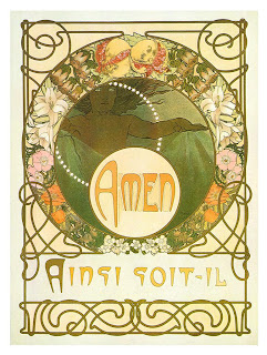
I chose two works from Mucha specifically because the figures remind me of myself in the last year. The winter girl from Mucha's The Seasons seems lonely and cold, yet content and even happy. She reminds me of myself because although I have been lonely since my family moved away at the beginning of the school year, I've been really blessed by a fantastic boyfriend, great friends, perfectly timed opportunities, and so on. The expression of the girl with the paintbrush reminds me of the work I've been putting into my own art and the thoughts that spin through my head at all times. I tweaked the color of her hair to match mine a little better. The busy patterning in the work is meant to show how busy this year has been for me with school, RA responsibilities, work, and more. I replaced the text William Morris's Kelmscott logo with the school year, for obvious reasons. 


Here are my components:


Gothic/medieval influence -

 I included the Kelmscott logo because I found it to be a very obvious example of the medieval influence during the Arts and Crafts movement. That influence is evident in the Art Nouveau period as well, and can be seen best in some of the loose knotwork in Le Pater by Mucha. 


Pattern -

 Patterns are a very strong component in both the Art Nouveau and Arts and Crafts movement, particularly the latter. I included the Honeysuckle pattern by William Morris because I thought it was a very pretty example of the intricate patterns in the Arts and Crafts era. 


Japanese influence - 

The flat layered composition of Mucha's works, particularly The Seasons, is reminiscent of Japanese prints. This is common in Art Nouveau works. tried to reflect that in my own piece by layering the pictures and nesting them within each other.


Emphasis on female form - 

I included two of Mucha's iconic female figures in my work to illustrate the use of female figures in Art Nouveau images. 


Botanical forms - 

Plant forms are common in both Art Nouveau and Arts and Crafts. I put a lot of emphasis on botanical forms in my picture by including the Honeysuckle pattern by William Morris and the border from Mucha's Le Pater. There are also more stylized plant forms in Morris's Kelmscott logo and in The Seasons. 


Contrast of Asymmetry and Symmetry - 

I chose a symmetrical border from Mucha's Le Pater and placed the figures asymmetrically inside to imitate the layouts that are often seen in Art Nouveau works such as those by Alphonse Mucha. 


Contrast of Organic form and Geometric form - 

I kept the strong circular and rectangular forms to separate the work into sections, but these shapes are surrounded by organic patterns like knotwork and plant forms. This contrast shows up in a lot of Art Nouveau works and Arts and Crafts pieces, and is evident in The Seasons, Le Pater, and the Kelmscott logo. 


Decorative elements - 

Basically all of the knotwork, plant forms, and patterning can be termed as decorative elements in my work. Decorative elements, I think, are one of the most important and defining components of both the Art Nouveau and Arts and Crafts, as nearly every work has some kind of decoration to it. 


Stylized figures - 

Art nouveau's figures tend to be very stylized. Mucha's figures often feature simplified faces and long, flowing hair and gowns. I picked two of his very stylized figures to feature in my piece. 


Complexity vs. Simplicity - 

Arts and Crafts works tend to be very complex, such as the Honeysuckle pattern and even the Kelmscott logo by Morris. Art Nouveau has a lovely contrast of complexity and simplicity, which can be seen by Mucha's complex plant borders juxtaposed with his relatively simple figures (simple in that their actual bodies and faces do not involve a lot of line work or shading). I reflected this in my work by surrounding two clean figures by a lot of very dense complex patterning. 

Wednesday, March 23, 2011

Printing press - before and after


Long before the advent of the printing press, books were priceless, treasured works of fine art dedicated only to what was considered noble causes such as religion or royalty. They were simply so time-consuming and expensive to make, that only the very rich or the very dedicated (monks) could have them produced. Every page, every letter, had to be hand drawn. The materials were expensive and sometimes hard to come by, books were made on animal skins and each color of ink had to be hand made before use. Most of the early examples of these books that we have now are portions of the Bible or are otherwise dedicated to the Christian faith.


Book of Kells
The Book of Kells, which Meggs describes as “the culmination of Celtic illumination” [47] is a beautiful example of the painstaking detail and sheer amount of work that would go into these European Christian manuscripts. The Book of Kells features ornate capitals, huge initial letters, complicated full-page illustrations, intricate knot work, fluid interlacing, careful patterns, and precise lettering. The amount of time that would have gone into a work like this is staggering, and had to be split among many people inside a workshop known as a scriptorium. No two manuscripts would ever end up quite the same, making each it’s own priceless work of art.

The next step toward the printing press was the introduction of woodblock printing in Europe. This method was already used earlier in history in other countries, but was now gaining popularity in European countries. Although creating a wood block image for printing was still a painstaking process, often still done in a scriptorium, the creation of woodblocks combined with the new practice of using paper made books significantly cheaper and easier to produce in more quantities.


Biblia Paupernum
Pages such as this one from a Biblia Paupernum (Bible of the Poor) show a few of the similarities to earlier manuscripts that were very evident in printing before the printing press. Though there is much less detail and certainly not the same depth in color as manuscripts such as the Book of Kells or the Limbourg brothers’ Les tres riches heures du duc de Berry (The Very Rich Hours of the Duke of Berry), the composition of the page and the illustrative style still have a very medieval manuscript feel to them. At this point, text was being carved directly into the woodblock around the images, so the pages still have a handmade feel to them although they can be copied exactly over and over. Often the woodblock prints were hand painted as well, further connecting them to earlier book making methods. Although it was still a time-consuming and careful process, woodblock printing made it possible to print Bibles like this in relative bulk to bring the gospels to the poorer man. Books were no longer limited to only the church or the very rich, like the Book of Kells or the later Book of Hours manuscripts, and woodblock printing could be used for other things such as spreading information and creating objects like playing cards.


Nuremberg Chronicle
The Very Rich Hours of the Duke of Berry
Nuremberg Chronicle


When moveable type printing and the printing press came about, woodblock printing became used more exclusively for illustration, and the text itself began to be made with more regularity and less of a hand made feel. Type and illustration began to become more separated, and books began to have more of a layout like we are used to today. Woodcut illustrations were still often hand painted after printing, and people like Albrecht Durer and Anton Koberger furthered woodblock illustration as an art form, creating block prints with more careful detail and composition than were previously seen. These pages from the Nuremberg Chronicle are a good example of how the layout of books was beginning to change. Illustrations no longer have the organic feel that they did in the days of manuscripts; they don’t flow through the text and become parts of lettering nearly as often. Both illustrations and text become more self-contained, in tightly fitted rectangular sections of picture and type. Even in the page where the church tower sticks into the text, the text surrounds it in a rectangular pattern, not breaking into its space. Book layouts become very different and less reminiscent of the manuscripts that came before them.


This was the only picture I could find, a bigger one is on Meggs page 107
Text itself is also beginning to become less calligraphic and has much less of a handmade feel. Type is standardized and modernized, and specific print fonts are created and put into use. As the Renaissance comes about, we begin to see books that look very much like the books we have now, and far less like the handmade manuscripts we saw in earlier times. Print has now become its own art form, with its own conventions and its own unique styles. The printed book no longer mimics the manuscript, although they are still at their root inspired by handmade books. This page by Geoffroy Tory in Champ Fleury is a good example of how the layout of the text itself (the way it is broken up, the different sections of information) becomes more important and more of a way of emphasizing the content in and of itself than it was in the past. Illustration is still important, but it is more supplementary and takes up less of the page. The layout of both text and illustration is treated as a composition and white space on the paper is left to enhance this composition. By this time, we can see how are own modern styles of print come about and how both text and illustration have evolved greatly over time.

Saturday, February 26, 2011

Alice in... Manuscript.. Land...


Not exactly the best quality photos, but here are my manuscript pages.

Here are a couple of the pages I used for inspiration:


Monday, February 14, 2011

The Book of Kells


I absolutely fell in love with The Secret of Kells. I wanted to wait to write this until after I had watched it again and really been able to pay attention to the details. The depth of every design in the movie is breathtaking, you can see knotwork and ancient Celtic symbols worked into the trees and plants, drawings resembling manuscripts surrounding the characters, colors that remind of the Book of Kells, etc. One subtle thing that I really loved was how many scenes were flat, that is the landscapes and perspective was laid out like a page out of a book, the style was extremely illustrative and hearkened back over and over to the original manuscripts. Even the characters themselves were often a modernized version of the people in the manuscripts. The animals, especially the wolves, looked like they were straight out of the book as well. Another thing was that people and objects would tend to be contained within shapes, such as if you saw a group of people, they were usually all contained within the shape of the person in the back of the group. That really reminded me of some of the detailed shapes within bigger shaps in the Celtic manuscripts. All this rambling can be summed up in saying I think The Book of Kells was one of the most beautiful and inspiring pieces of animation I've ever seen.


Friday, February 4, 2011


I couldn't find much that reminded me of the Beatus manuscripts, so I opted for something that reminds of other European manuscripts. The storybooks from the openings of classic Disney princess movies! These books are very obviously directly based on medieval manuscripts. I think they're absolutely beautiful, particularly the Snow White book (which is ironic, considering that Snow White is my least favorite Disney princess). The illustration style is obviously more modern, but you can see the carpet page style illustration in the Sleeping Beauty book, and historiated capitals in all three books. I think these are a great example of a more modern take on very old European manuscripts.

Celtic inspired design


This is a t-shirt design I found based on the Celtic cross. You see this cross design with the circle and the knots in a lot of Irish churches and graveyards. I see it in a lot of tribal style designs, which seem to be pretty popular right now. There is knotwork in the cross itself and it's laid out like a piece of Celtic jewelry, with a jewel in the middle. The black and white tribal patterns in the background are like modernized versions of some of the swirled patterns we see in the Celtic jewelry and manuscripts and they echo the shape of the cross itself. Behind the cross, very faintly in the background, is a very similar pattern to some of those in the manuscripts, particularly behind the top right corner. I thought this was a pretty good example of very modern design inspired by Celtic patterns and icons.

Monday, January 31, 2011

Cave art


I had an extremely difficult time finding a piece that was inspired by the periods we went over last class that included text or could be called graphic design (or that weren't Egyptian!). I also could find very little about this particular design, other than it is art that is printed on many products on a not very well design website. This image itself, however, is well done, I think. It really is consistent with a lot of the cave art that we looked at, and at a very quick first glance at the thumbnail, could almost be mistaken for an actual image. The UFO throws that off though. It is a funny modern idea put in an ancient context, and not very badly either. I wish I could have found a more serious design, but I did find this one very amusing and thought it combined ancient art with modern ideas in a very obvious way.

Wednesday, January 12, 2011

THIS BLOG IS NOW FOR A DIFFERENT CLASS!

PAY NO ATTENTION TO THE POSTS BELOW.

Well, you can, but they're not relevant to this class. Because it's a different class. The stuff down there is probably cool, but... yeah.